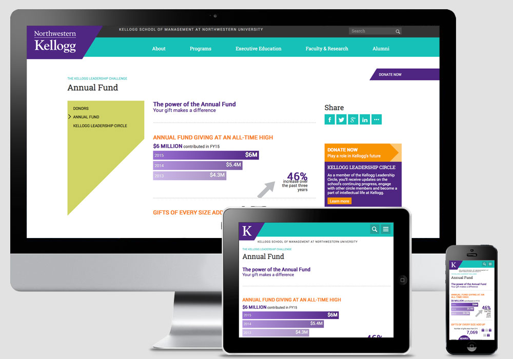
A view of the Annual Fund Page
Description
I had created the KLC Challenge website for Kellogg in the Spring of 2016. The Annual Fund page within the site was used to share donor statistics to Kellogg Alumni. However, the content for the page was to simply be a screen-grab from a PDF print piece. This created a boring user experience. The whole point of this website was to get people excited about donating to Kellogg. After the launch of the site, with the whole page being a boring image, I used up my time in between projects and meetings to build out the extensive information in HTML, then used CSS key frames to add engaging animations that grabbed the reader's attention.
Client
The Kellogg School of Management
Roles
- Website Developer
- Interactive Designer
Tools
- Dreamweaver CC
- Illustrator CC
- Javascript/jQuery
- HTML5/CSS3